Timesheet App
Client:
A world-wide mining engineering group
Role:
UI / UX
Tools:
Sketch, Figma, Adobe Illustrator, Invision
o1. The Problem
The client employed over 250 workshop technicians in Australia, each of whom had to manually write out a timesheet every fortnight in order to get paid. This paper-based system often resulted in errors due to mistakes in transposing, miscalculation and general human forgetfulness.
The process looked like the following:
- Employees would complete their timesheets, recalling a large number of job numbers and hours for memory.
- These timesheets were physically signed off by a supervisor.
- The timesheets were then scanned and emailed to the payroll team.
- The payroll team would then manually type up each timesheet entry into the accounts system.
It was a tedious process that allowed too easily for human error affecting employee's pay.
o2. The Process
User interviews
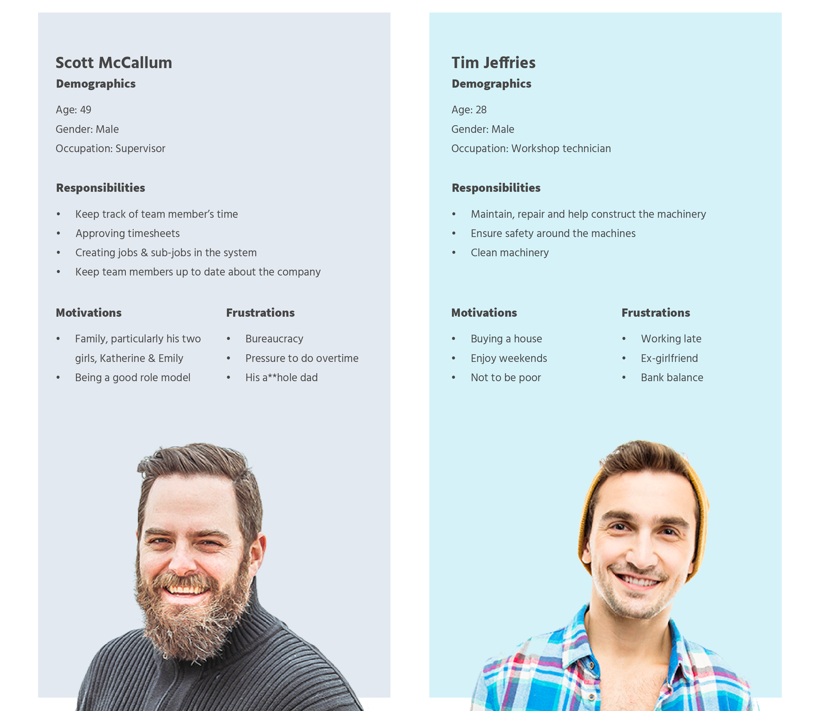
We interviewed several employees including those who worked on site, supervisors and accounts staff. We asked the employees to walk us through how they completed their timesheets, when and how often they would do so, and what their priorities were for their jobs.
Insights
The employees were not high phone users. Most used their phones simply to text, make calls, and check Facebook.
The employees had rough and dirty hands from working with machinery making using a phone somewhat difficult.
Employees would fill out their timesheets at different times and frequencies in the week: some would complete them every day, some only at the end of the week
This was a job to get paid. Therefore getting paid correctly was the utmost priority.
Personas
Planning
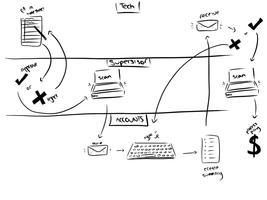
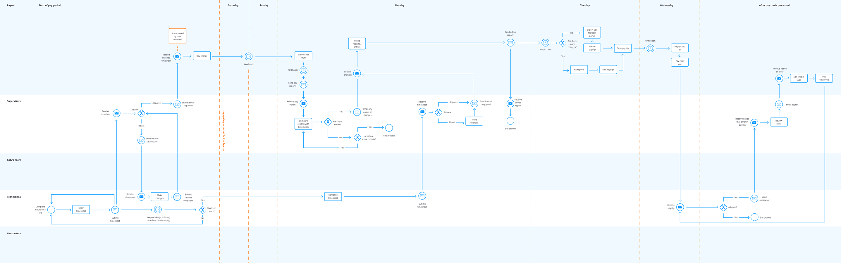
We conducted a series of process mapping sessions with the client to gain a thorough understanding of processes and to identify problem areas that we could improve upon.
While the goal was to create a completely paperless system, we wanted to maintain the familiarity that users had with the current processes to ensure that the product would be able to be adopted smoothly across the company.
From the user journey mapping workshops I created process diagrams that conveyed the entire timesheet entry and processing user flow. This was incredibly helpful in understanding communication breakdowns in the current process and enabled us to identify areas for automation and improvement in efficiency.
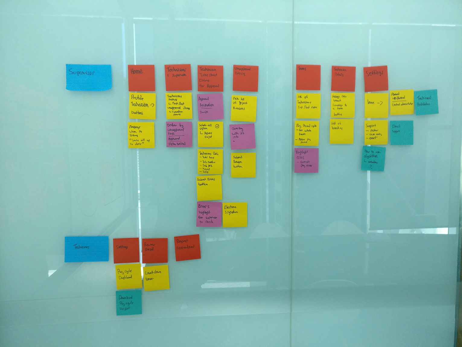
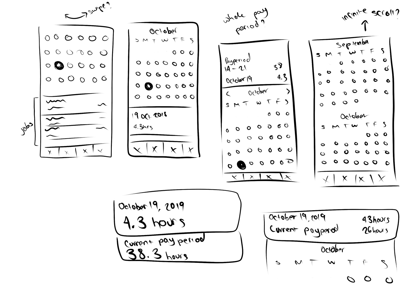
Sketches
After the process was mapped out, features could be fleshed out and designed more carefully. Each feature was refined, sketched, wireframed, and prototyped for testing.
Usability testing
We conducted usability testing with the employees and supervisors as features were completed.
Feedback
The app was `too simple`. By breaking down the steps too much, actions took too long for the employees to complete.
The app was going to be primarily used on iPads rather than iPhones (as we had previously thought).
Some of the interactions moved too fast for the users, therefore surprising users when actions occurred without their understanding why.
Employees wanted the number of hours worked each day to be more prominent on the screen.
o3. Visual Design
Influencing factors
- Fat fingered approach: The client was very concerned about their employees tech capabilities and wanted the app to be as easy to adopt as possible. The employees also worked with their hands a lot and were not particularly ‘delicate’.
- Union restrictions: We not able to assist the users as much as we would have liked in some areas of the app. Most notably, we couldn't calculate the total hours entered due to this potentially being construed as "interpretation of hours".
Hierarchy
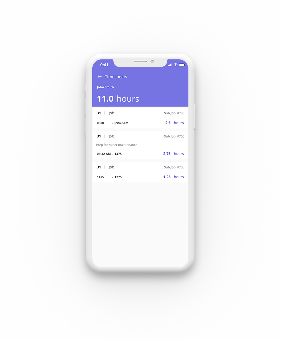
I relied heavily on user feedback to gain an understanding of what was deemed ‘critical’ information to the users on each screen. Earlier designs had emphasised the date in the header however we ultimately moved the emphasis to being placed on the hours entered for the day as this is what most affected their pay.

Gesture
To accommodate the “fat fingered approach”, we decided early on to use swiping gestures for users to action timesheets. Positive actions were always swiped to the right, while negative actions swiped left.

Colour
I stuck to a simple 3 tone colour scheme to ensure there was little confusion in regards to colour meaning. Green meant approved, red meant denied, and the purple tones indicated un-actioned timesheets. These colours were bright but not aggressive and used consistently across the app to highlight any areas of alert for the users.
#7674e2
#4CCEC9
#FF7676
o4. The Outcome
We developed an app that enabled employeess to enter their hours easily, recall job numbers previously entered, communicate approvals and rejections immediately and, most importantly, reduce errors so that employees would get paid correctly.
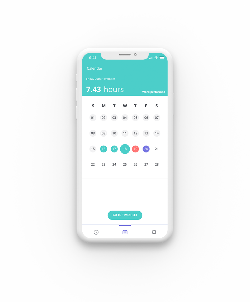
Calendar
The calendar provides an overview of the pay period, using colour to clearly indicate the status of the timesheet for that day (eg. approved, rejected, un-actioned).
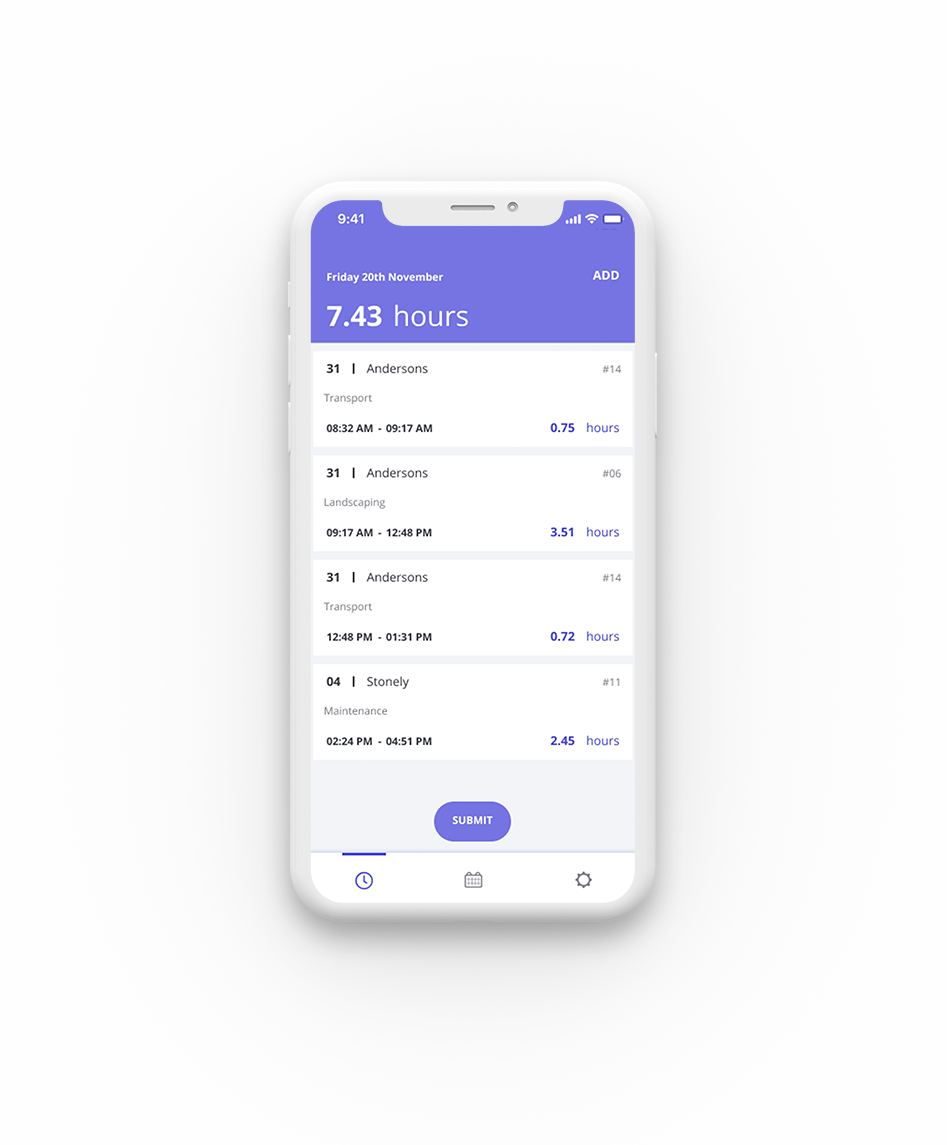
Day View
The day view displays what most closely resembles a timesheet for that day. It lists the jobs entered and hours associated with that job.
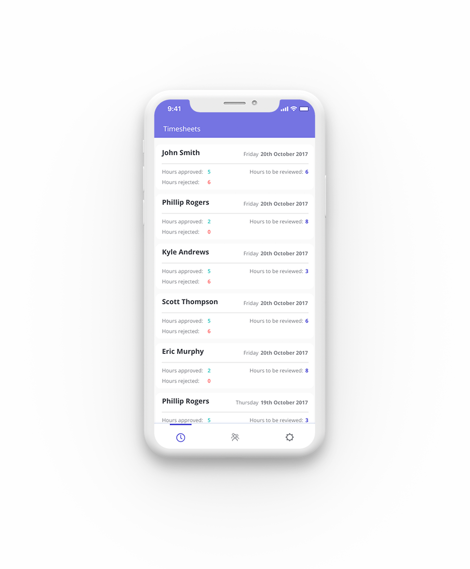
Team Members
This view provides an overview of all the timesheets requiring action and how many hours each team member has worked during a pay period.
Approval Process
Supervisors are able to see each team member's timesheet broken down so they know exactly what they are approving or rejecting.